UNIT 1: BRIEF 5: Methods of Contextualising
We chose FIJI water as our greenwashing advertising campaign for Brief 5, Green for Whom, Methods of Contextualising.
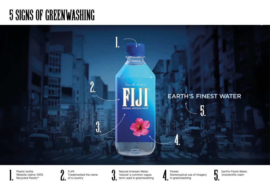
I initially started with the end frame of the advert we chose for our Green for Whom greenwashing campaign, to start to investigate signs of greenwashing we had identified. I was going to develop these five signs through the five petals of the flower but each was so vast I didn’t know where to start. There was also the background that I hadn’t even started to deconstruct either. So I changed my approach.

I started trying to make sense of all the research by diagramming, I needed a fluid structure so worked along the veins of the petal of the hibiscus flower featured on the FIJI water bottle. I started by initially noting the advert itself and some of its key points. The advert uses juxtaposition of colourful Fijian nature and dark, smoggy, busy, cityscapes, to symbolise it’s natural credentials.

I highlighted the words they wanted the viewer to associate with the brand in pink and the juxtaposed images that they said implied they were not in white.

We removed the white negative elements to interrogate their chosen rhetoric. The language and images are repeatedly of nature (flower, sea, earth, mountains), exclusivity (finest, best, artesan) and exotic (hibiscus, untouched).

I put these words into their colours in nature and found a second layer, invisibly reinforcing the language, as all elements were blue, green, yellow or white. Colours of nature.

When excluding the preferred associated language and revealing just the juxtapositional images and language, ironically these words chime closer to the reality behind the ‘green’ exterior. The juxtaposition has become a contradiction.

How can I dig deeper through this method of diagramming and iterating. What lies beneath the petal? The petal is made up of a series of cells the connect, combine, overlap that is complex and deep.

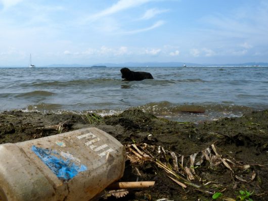
To dig deeper into the claims of the adverts we used the product itself as a starting point.
The bottle is square and transparent, with a round blue lid (its shape is itself a contradiction). It uses language such as ‘natural’ and ‘earths finest’.
We went to the website where there were a whole series of eco credential claims, but on closer inspection are, as Abdula prothesised, to increase consumption and further damage the environment.
We’ve mentioned the five sizes of bottles and the lack of recycled plastic. There is also claims of “Adopting low sulphur fuel standard for all shipping” what about if you didn’t ship to 60 countries in the first place? Compounded by the proud proclaimation “16,000 miles from nearest continent”, which really translates as even more pollution in shipping. Add to that the plastic used in the bottles originates in China, that’s another 5000 miles to the carbon footprint.
This is one of many laughable and ridiculous claims, dressed as positive accolades in sophisticated branding gift wrapping the “gift” of nature. The best one, is its claim of a “smooth and soft taste”. I’m not sure I have had a water that isn’t smooth nor soft.
We colour coded the claims and counterclaims into contradictory, greenwashing, politics of production and overconsumption to interrogate this hidden layer beneath the campaign.
But how do we go deeper?

We went to the roots to interrogate wider systems and networks. Based on this diagram I thought there was no way we could find this many systems and networks…

But I did, from an advertising agency that would have been awarded the campaign as the first root, I then uncovered transportation systems, manufacturing processes and plants, distribution channels within each of the 60 countries, the Fijians who live and work locally.
Each of these roots has countless off shoots of complex systems of people, jobs, resources, materials and land that further deepend the environmental damage of a single bottle of water.

We colour coded the networks and systems into land, materials and people. The diagram itself is complex as the roots overlap and tangle, nothing is straight which further heightened the intersectionality and, quite frankly, was overwhelming.
How can you begin to undo all of this?
This felt very negative, so we thought about individuals and groups, local and global.

Top right is very yellow and on the edge, this happens to be the local Fijian people. At the root of the root right at the bottom is David Gilmour the founder of Fiji water. With a penchant for Hollywood and the luxury lifestyle we start to uncover one man’s desires emerging through a bottle of water. Gilmour used celebrity and product placement as advertising for a long time before these more traditional TV adverts, he appeared in a few Hollywood films, his water is on the red carpet, he employed a Hollywood composer to write the sound track for the advert. A network of croyism and white male back scratching began to appear. A system of partriarchy and capitalism oppressing marginalised groups just as the Ecofeminist suspect.
So if one man started this, can one designer change this?

If we iterate the graphic to be micro it suddenly becomes smaller. Does this make it more manageable? If we look at it through a macro lens, it magnifies the complexity and intersectionality…
And this is just one product of many millions more that have similar roots.

Through the diagramming I was able to uncover and organise hidden complexities. It also drew my attention to the roots where I connected more deeply at the local, community level. The Fiji bottled looks pretty computer generated, as did our diagrams, so how can we render this project in a more ecological, sympathetic and organic way?
I discovered some Fijian art, Masi Kesa that is produced by indigenous women of Fiji.
The material is made from soaked bark of local trees and pounded to make the sheets of cotton like material. It is then stenciled, inked or hand painted with symbolic shapes originating from the Lapita peoples.
Contradictory to everything Fiji water is, this felt like a good way to iterate our project more deeply. So I created my own Masi Kesa.
Adhoc using an old roll of wallpaper, I made a few stencils and organically created patterns like the examples I found. This was so therapeutic and I engaged with the values that the Fijians embody when stenciling which gave it greater depth and meaning.


This experiment raised questions that could take this method and iterate further. What happens if we challenge the power, challenge capitalism, challenge the community, how would these pieces of art look and feel? If money didn’t exist would the power blocks even be there? How would it look if capitalism didn’t exist? What if there was no aquifer in the first place?


I chose these two quotes from the two references that intrigued me to use as a lens to look deeper into the project.